Case Studies
Colour Schemes for Your Home Interiors
Choosing the right colour scheme for your home is one of the most fundamental yet powerful decisions in interior design. Colour has the ability to influence mood, perception of space, and the overall aesthetic harmony of your home. At Kuvio Studio, we understand how thoughtfully selected hues can breathe life into a space—creating warmth, vibrancy, or calm depending on your vision.
🌈 Why Colour Matters in Interior Design
Colours are more than just visual elements; they carry emotional, psychological, and spatial implications. A well-balanced palette can make a small room appear larger, a dull area feel more alive, and your entire home reflect your personality.
Psychological Impact: Warm tones (reds, oranges, yellows) tend to energize, while cool tones (blues, greens, purples) soothe and calm.
Functional Enhancement: Lighter shades make spaces feel more open; darker tones add intimacy and drama.
Cohesion Across Spaces: A unified colour theme across rooms brings aesthetic flow and prevents visual chaos.
🎯 The 60–30–10 Rule: A Timeless Formula
One of the most effective principles we follow in design is the 60–30–10 Rule, a simple yet impactful formula that ensures balance in any colour scheme:
60% Dominant Colour: This is usually the wall colour or large elements like sofas and rugs, forming the main background of your room.
30% Secondary Colour: Used for furniture, drapes, or an accent wall, this tone complements the dominant colour without overpowering it.
10% Accent Colour: The smallest portion, reserved for décor items, cushions, art, or statement pieces that add contrast and flair.
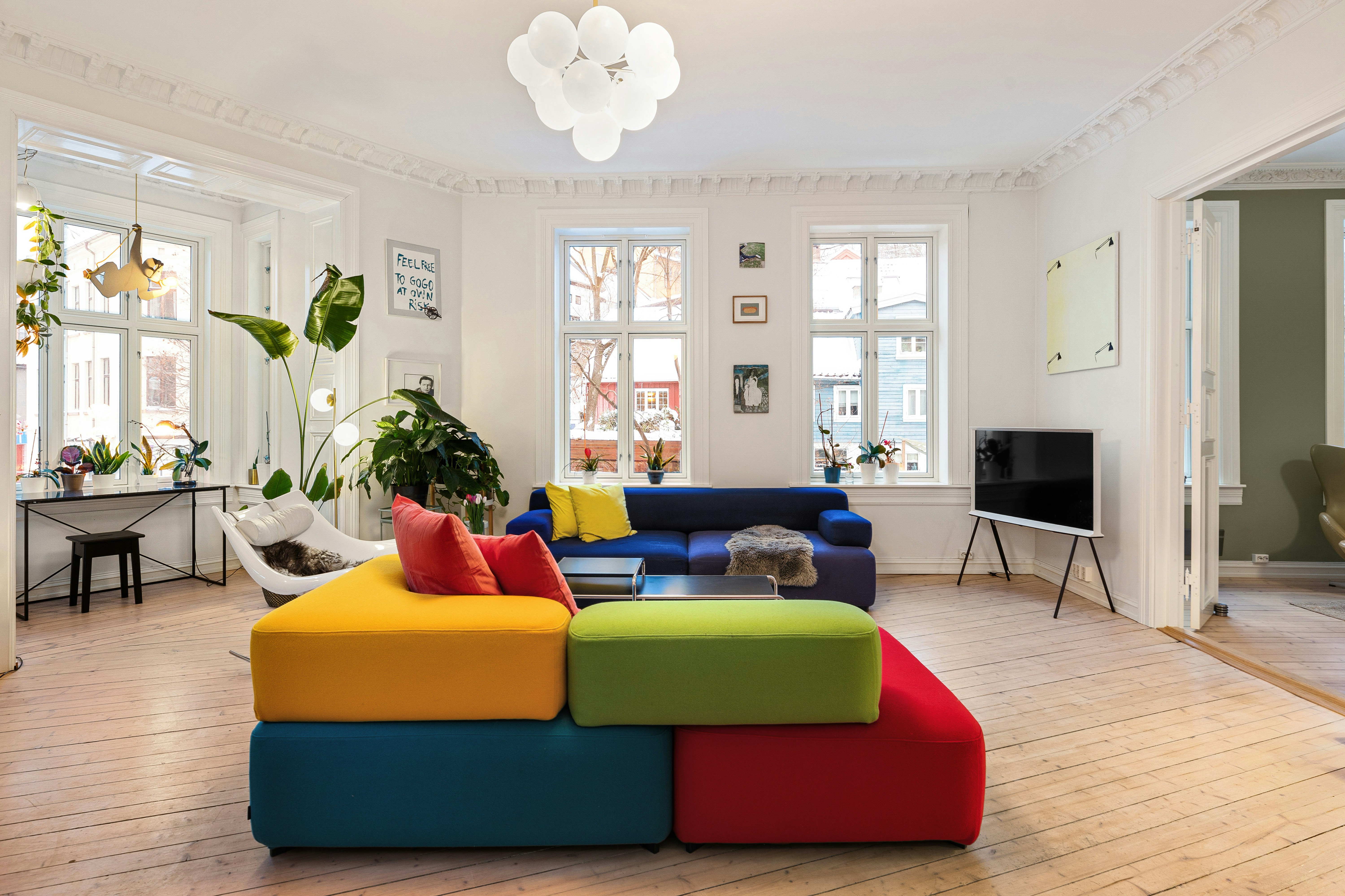
👉 Example: In a modern living room, you might have beige (60%), deep navy furniture (30%), and mustard yellow cushions or vases (10%).
🏠 Room-by-Room Colour Tips
Each room in your home serves a different purpose, and colour choices should enhance those functions:
1. Living Room
Go for warm neutrals or earthy tones that encourage conversation and relaxation. Olive green, terracotta, or cream paired with wood textures can feel inviting yet sophisticated.
2. Bedroom
Stick to calming hues like lavender, icy blue, or soft greys to create a restful sanctuary. These promote better sleep and serenity.
3. Kitchen
Consider fresh, energizing colours like mint green, lemon yellow, or clean whites. These shades promote cleanliness and stimulate appetite.
4. Bathroom
Use ocean-inspired palettes—whites, teals, and greys—that evoke cleanliness and tranquility.
5. Study/Workspace
Pick focus-enhancing colours like deep greens or subtle blues, known to improve concentration and mental clarity.
🖼️ Accentuating with Texture and Material
Colour isn’t just about paint—it lives in textures too. Pairing the right hues with different surfaces can enhance their effect:
Matte finishes mute the tone for a softer vibe.
Glossy finishes reflect light and intensify colour.
Wood, metal, and stone surfaces naturally add warmth or contrast depending on their undertones.
🎨 Kuvio’s Approach to Colour Harmony
At Kuvio Studio, we customize every colour palette to align with your space’s lighting, purpose, and personality. Whether you want minimalist monochromes, bold contrasts, or timeless earthy blends, we guide you through:
Mood Mapping – Understanding what mood each room should evoke.
Lighting Analysis – Evaluating natural and artificial light impacts.
Swatch Testing – Trying real samples on your walls before finalizing.
Colour Psychology Consultation – Ensuring your space supports well-being, creativity, and comfort.
🛋️ Final Thought
The perfect colour scheme is not about trends—it's about creating a home that feels like you. Thoughtful selection and balanced application of colours can elevate your interiors from functional to truly phenomenal.